Flexbox Row + OverflowX issue

· One min read
Imagine Chiu
Front End Engineer @ Acrool

When using Flexbox for typesetting, you sometimes encounter a similar problem. The content cannot be stretched when it overflows, causing the background to be unable to display the entire block.

Flex(Row) + Overflow-x issue

scroll right check the overflow-x issue, background color not full width

CurrentRank
11~20
x1.60%
x1.70%
x1.80%
x1.90%
x2.00%
x2.00%
x2.00%
x2.00%
x2.00%
Next Level
Friends Rolling
Rebate
Number Withdrawal
Friends Rolling
Friends Rolling
Friends Rolling
Friends Rolling
Friends Rolling
Friends Rolling
Next Rank
21~30
x1.60%
x1.70%
x1.80%
x1.90%
x2.00%
x2.00%
x2.00%
x2.00%
x2.00%
<section className="d-flex flex-column overflow-X">
<div>curr level</div>
<div>title</div>
<div>next level</div>
</section>

Fix version

scroll right check, background color full width, mainly separate flex column from overflow-x

CurrentRank
11~20
x1.60%
x1.70%
x1.80%
x1.90%
x2.00%
x2.00%
x2.00%
x2.00%
x2.00%
Next Level
Friends Rolling
Rebate
Number Withdrawal
Friends Rolling
Friends Rolling
Friends Rolling
Friends Rolling
Friends Rolling
Friends Rolling
Next Rank
21~30
x1.60%
x1.70%
x1.80%
x1.90%
x2.00%
x2.00%
x2.00%
x2.00%
x2.00%
<section className="d-flex overflow-X">
<div className="flex-column">
<div>curr level</div>
<div>title</div>
<div>next level</div>
</div>

</section>

GridThemeProvider override style issues

· One min read
Imagine Chiu
Front End Engineer @ Acrool

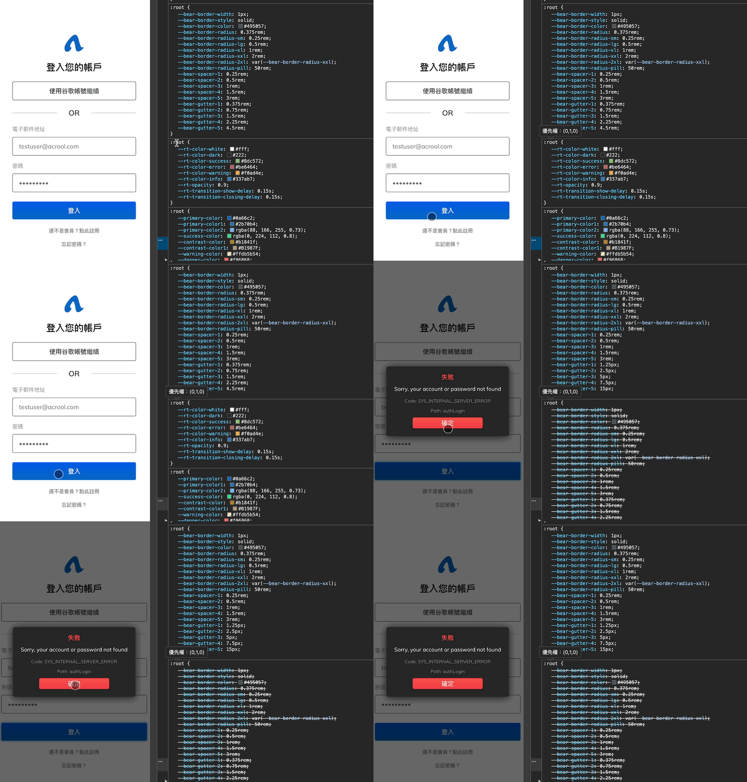
v5 version uses GridThemeProvider to override style issues

The following is an example of a schematic program

bug-sample.png

const Dialog = ({type, title, message, buttons}) => {
return (
<DialogRoot>
<Title type={type}>{title}</Title>
<MessageContent dangerouslySetInnerHTML={{__html: message}} />
<GridThemeProvider gridTheme={{
gutter: '5px',
}}>
<Container fluid>
<Row>
{buttons.map(row => (
<Col key={row.id} col>
<ModalButton>{row.text}</ModalButton>
</Col>
))}
</Row>
</Container>
</GridThemeProvider>

</DialogRoot>
);
};

const App = () => {
return (
<GridThemeProvider>
<Dialog/>
</GridThemeProvider>
);
};

You can find the overwriting done in Modal in order to change the gutter's spacing setting. But because the v5 version changed to use createGlobalStyle of styled-component to set the :root CSS variable, when the light box is inserted into the Dom, createGlobalStyle inserts new settings into the dom again, overwriting the original CSS settings, causing the version to run.

Warning

Please do not use GridThemeProvider again in the lower layer, causing secondary generation: the root parameter will overwrite the original parameter.

Overriding styles are used in v4.x version. For v5.x version, please make good use of utils className gx-? or CSS variable --bear-gutter-x

Frontend Slicing Rule

· 3 min read
Imagine Chiu
Front End Engineer @ Acrool

Front-end design and development, including design and development

Over-reliance on content, static hard-coded layout

  • Highly written to death
  • Padding

Because the design draft is dead, in the case of an unstandardized design draft, we should continue with the front-end specification, or the first version of the design specification. You shouldn’t just follow it without specifications. “Responsive design” considers not just different displays in different sizes, but “adaptation to space.” Regardless of whether designers today start from the perspective of graphic design, we should all think about "responsive design" as the starting point.

One of the biggest problems is "over-reliance on content"

Text modification, changes, and text lengths in different languages ​​are calculated just right, with one height setting for each size (xs, sm, md, lg, xl, xxl)

Should high-height content be stretched or overflow characters?

Write down the width and height, each Padding, Margin according to the design draft, and set it carefully according to each size (xs, sm, md, lg, xl, xxl each setting)

The common settings are recognized, the design draft will not be moved, and the macro adjustment example should not become only xs -> md -> xxl

Regardless of the full page, the width should be expanded by the content, and the width should be written directly. According to the design draft, each size should be carefully set.

Identify whether it is full version or content expanded height + Padding

Project card list, if the project is added, calculate the number of pixels

100px cut into 4 equal parts should be 25%, not 25px

Margin and Padding

The interval between items is Margin

Uniformly use the margin-bottom principle to open the bottom and how much space should be separated

Tweens within the project, for Padding

Since we occasionally encounter padding in design, but specific elements are full, it is recommended to set padding between each block instead of setting padding for a large block, and this padding is a fixed CSS parameter. set up

If possible, it doesn’t matter if you have one more layer. Don’t just think about copying.

Sometimes cutting the front-end design into layout layer and style layer is of great help for subsequent maintenance, reading and adjustment. Allows you to directly separate categories in your vision

As for the naming issue, namespace

There is no BEM naming problem when using Styled-component because it will do BEM for you. This naming issue also involves clearly defining the dom structure,

Container is Container, Grid is Grid, Component splitting makes it easier for us to name separate spaces.

For example:

Title and Desc are almost everywhere. If the namespace is not split, they will be ProductTitle and GoodsTitle.

No matter what, there must be a grid system and ZIndex principle

You need to have a system responsible for typesetting, whether it is a boostrap grid system or a tailwind grid system. As long as all customization is not blind, "I want it to be the same as the design draft"

Use CSS Grid Posture

· 5 min read
Imagine Chiu
Front End Engineer @ Acrool

Grid is a grid system that you can think of as a table. It has concepts similar to a table, such as merging cells, rows, and columns.

Compared to Flexbox, it transitions from a one-dimensional to a two-dimensional layout, with proportions often determined by external declarations in most cases.

Let's take a look at the syntax.

Let me confirm what CSS Grid looks like first.

.grid-table{
display: grid;
grid-auto-flow: column dense;
grid-auto-columns: 1fr 1fr;
grid-auto-rows: 1fr;
grid-template-columns: 1fr 1fr;
grid-template-rows: 1fr 1fr;
gap: 0px 0px;
}

or

.grid-wrapper{
grid-template-areas:
". head"
"nav main"
". footer";
}
.header { grid-area: 1 / 1 / 2 / 4 }
.main { grid-area: 2 / 1 / 4 / 2 }
.anv { grid-area: 2 / 3 / 5 / 4 }
.footer { grid-area: 4 / 1 / 5 / 2 }

It may look a bit complex, but in practice, we'll mainly be using grid-template-columns and gap.

  • grid-template-columns specifies how many columns and their proportions.
  • grid-template-rows specifies how many rows and their proportions. If you want rows to automatically wrap like Flexbox, you can set it to 1fr.
  • gap is for the spacing between grid items, which will be explained further below.

Inner Gap

In Grid, instead of using percentages for grid layout, you specify the actual number of grid tracks an item occupies (e.g., 5fr). This eliminates issues where the gap isn't calculated as a percentage (e.g., as in Flexbox). This aspect is a relative advantage of Grid because you don't need to use negative margins on rows to offset column padding.

Confirm alignment

Let's test the alignment first, deep into your memory.

gridAutoFlow: Row

Flex Col
justify-self
Flex Col
Align Item
Align Content
Justify Item
Justify Content

gridAutoFlow: Column

Flex Col
align-self
Flex Col
Align Item
Align Content
Justify Item
Justify Content

Then we will notice that it doesn't have the same issues as Flexbox, with different main axes for columns and rows. We can simply treat it as if it's just a row. If you're not familiar with Flexbox, you might wonder why the layout is filling the space even when the width is set to auto?

Yes, this is the alignment feature of Flexbox and Grid. In Normal, the sub-items will fill up. If you don't want to fill them up, then you need to give it an alignment mode.

Then we will find that it is just like Flexbox. Although it still has Column and Row, it does not have the problem of different main axes and intersecting lines.

In addition, the definitions of items and content also need to be clearly clarified (ex: align-items, align-content)

  • items: Alignment of individual items
  • content: content alignment
  • place-content: set align-content and justify-content at the same time
  • place-items: set align-items and justify-items at the same time

Using components to accomplish this.

import {Grid} from '@acrool/react-grid';

<Grid col={3} className="g-4">
<div>child</div>
<div>child</div>
<div>child</div>
</Grid>

This means grid-auto-columns: repeat(3, auto), and in CSS-in-JS, you can use children.count() for general layout purposes. The gap is set to 2px. However, if you are creating a product list today, you can specify proportions.

import {Grid, auto} from '@acrool/react-grid';

<Grid col={auto(3)} className="g-3">
<div>child 1</div>
<div>child 2</div>
<div>child 3</div>
<div>child 4</div>
<div>child 5</div>
<div>child 6</div>
</Grid>

This way, you will have three items per row, and every three items will automatically wrap to a new line.

For related parameters, you can refer to the CSS Grid Component

Align

If you want to align, you can use a utilities class style:

import {Grid} from '@acrool/react-grid';

<Grid col={3} className="justify-content-start align-content-start g-3"
>
<div>child 1</div>
<div>child 2</div>
<div>child 3</div>
</Grid>

Utilities style there are also responsive styles

Direction

Arrange left to right or top to bottom? like flex-direction

The alignment demonstration of Flexbox column is in this way. I hope that it exceeds the line break from top to bottom, rather than from left to right and exceeds the line break. Sample

.grid-wrapper{
grid-auto-flow: column;
}

Merging

If you have merging requirements or if you want to decide from within, you can:

import {Grid} from '@acrool/react-grid';

<Grid col={3} className="g-3">
<div className="g-col-2">child 1</div>
<div>child 2</div>
<div className="g-col-2">child 1</div>
<div

Responsive

If you have responsive requirements, you can:

import {Grid, auto} from '@acrool/react-grid';

<Grid col={1} md={`200px ${auto(2)}`} className="g-3">

<div className="g-col-md-2">child 1</div>
<div>child 2</div>
<div>child 3</div>
<div>child 4</div>
</Grid>

In conclusion

In normal times, I recommend using combo skills directly

  • Layout
    • Container(ex: g-?) > Row(ex: g-?) > Col + Utilities CSS
    • Container(ex: g-?) > Col + Utilities CSS
    • Col + Utilities CSS
  • Card List in % (not static width by card)
    • Grid + Utilities CSS(ex: g-?)

      因為 Flex 不能使用 % + gap

  • Card
    • Flex + Utilities CSS(ex: gap-?)
    • Grid + Utilities CSS(ex: g-?) (Use it if Flex is difficult to handle)

Example

import {auto,Flex,Grid} from '@acrool/react-grid';

<Flex className="gap-3">

Equivalent to

<Grid col={auto(2)} className="justify-content-start">

Or

<Flex col="column" className="g-3">

Equivalent to

<Grid col={1}>

You can use Flex, but you don’t necessarily need Grid, because you may still need to deal with alignment issues to cancel automatic expansion.

For complex styles, like a Gantt chart or segmenting various sections, it's advisable to declare a separate Styled-component.

I also recommend a handy tool for creating complex grids: https://grid.layoutit.com/

Flexbox+Gap Replace Grid System?

· 3 min read
Imagine Chiu
Front End Engineer @ Acrool

Flexbox can be used as Gap, directly speaking, it solves what Grid System wants to do, which is to use negative Margin in Row to offset the padding of Col at the beginning and end of a row.

Then... is there no problem?

I think if it was better, Bootstrap 5 would have changed it long ago

We can find that the length of the Gap will not be calculated and included in the flex item (25% * 4 if the ratio is used to allocate the space), that is, the Gap will be more than 100%, causing the version to run.

You can use an algorithm to use flex-basis: 0 0 ratio, but you can also use gap.

<Container>
<Row style={{'--bear-gutter-x': '20px'} as CSSProperties}>

<Col col={12}>
<Row style={{'--bear-gutter-x': '20px'} as CSSProperties}>
<Col col={8}>Col 1-1</Col>
<Col col={8}>Col 1-2</Col>
<Col col={8}>Col 1-3</Col>
</Row>
</Col>

<Col col={12}>
<Row style={{'--bear-gutter-x': '20px'} as CSSProperties}>
<Col col={8}>Col 2-1</Col>
<Col col={8}>Col 2-2</Col>
<Col col={8}>Col 2-3</Col>
</Row>
</Col>

</Row>
</Container>
Container
Row
Col
Grid System Nest
Col 1
Col 2
Col 1-1
Col 1-2
Col 1-3
Col 2-1
Col 2-2
Col 2-3
Flex + Gap Nest
Col 1
Col 2
Col 1-1
Col 1-2
Col 1-3
Col 2-1
Col 2-2
Col 2-3
<Container>
<GapRow gap="20px">

<GapCol col={12}>
<GapRow gap="20px">
<GapCol col={8}>Col 1-1</GapCol>
<GapCol col={8}>Col 1-2</GapCol>
<GapCol col={8}>Col 1-3</GapCol>
</GapRow>
</GapCol>

<GapCol col={12}>
<GapRow gap="20px">
<GapCol col={8}>Col 2-1</GapCol>
<GapCol col={8}>Col 2-2</GapCol>
<GapCol col={8}>Col 2-3</GapCol>
</GapRow>
</GapCol>

</GapRow>
</Container>
const totalColumn = 24;

/**
* 一個Container 幾個子 Col
* @param colVal
*/

const totalColCount = (colVal: number) => {
return Math.floor(totalColumn / colVal);
}

/**
* 一個Col佔比
* @param colVal
*/
const oneColP = (colVal: number) => {
return colVal / totalColumn * 100;
}

/**
* 一個Col佔比
* @param colVal
*/
const totalGap = (colVal: number) => {
return totalColCount(colVal) - 1;
}


const GapCol = styled.div<{
col?: number
}>`
${props => css`
flex: 0 0 calc(${oneColP(props.col)}% - (var(--flex-basic-gap) * (${totalGap(props.col)}) / ${totalColCount(props.col)}));
`}
`;

const GapRow = styled.div<{
gap?: string
}>`
${props => props.gap && css`
--flex-basic-gap: ${props.gap};
`}

box-sizing: border-box;
display: flex;
flex-wrap: wrap;
gap: var(--flex-basic-gap);
`;

The above is used. Grid System, the following is using Flex + to calculate Gap. It seems to be aligned, but there seems to be no difference? Kind of like Gap for the sake of thinking Gap

Another thought: Bootstrap 5 nested gutter?

One thing to note is that the design of Bootstrap 5 is to override --bs-gutter-x

The advantage of doing this is that we often introduce many different components so that they will not be affected

The next layer of nesting will not be affected. If you need the same thing below, you need to cover the lower layer again. Or set it from the final configuration file, which means that gutters is actually needed. Because we will need different gutter for grids in different sizes, and unify their gutter, Then make different gutter according to some blocks

in conclusion

So where is it suitable to use Flex + Gap?

Where there is no need to use proportions to allocate container space

It is a common place to use mr-? to push away

If you need a grid list, just use Grid System, or Flex + CSS Grid Gap

Flexbox alignment memory

· 2 min read
Imagine Chiu
Front End Engineer @ Acrool

As a front-end engineer, I have never had a very systematic way to use Flexbox alignment. I often use align-item-center when I need to align to center, and if that doesn't work, I'll try justify-content-center. If that still doesn't work... well, it should be a parent container height problem.

It's time to come up with a way to remember it today.

Main axis and cross axis

First, figure out who is the main axis and who is the cross axis

flexbox-alignment.png

  • justify-content control main axis alignment
  • align-items control cross axis alignment

Row (Arrange horizontally)

Row is horizontal alignment, so controlling the alignment of the main axis is horizontal alignment.

Flex
align-self
Flex

Column (vertical arrangement)

Column is a vertical layout, so controlling the alignment of the main axis is the same as controlling the vertical alignment

Flex
align-self
Flex

Finish

So we only need to remember that if the current flex direction is flex-row, then to center vertically, we need to control the opposite of the main axis. The cross axis is controlled by align-item. Conversely, if the current flex direction is flex-column, then to center vertically, we need to control the main axis. The main axis is controlled by justify-content.