2 posts tagged with "CSS Design"

View All Tags

GridThemeProvider override style issues

· One min read
Imagine Chiu
Front End Engineer @ Acrool

v5 version uses GridThemeProvider to override style issues

The following is an example of a schematic program
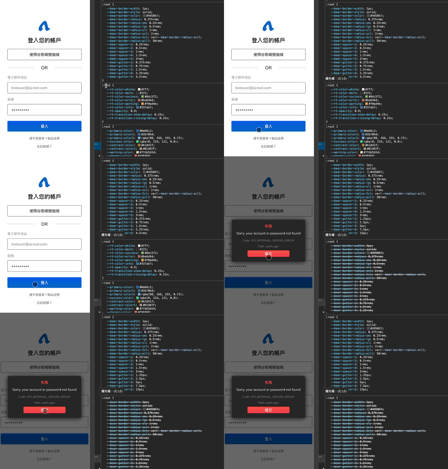
bug-sample.png

const Dialog = ({type, title, message, buttons}) => {
return (
<DialogRoot>
<Title type={type}>{title}</Title>
<MessageContent dangerouslySetInnerHTML={{__html: message}} />
<GridThemeProvider gridTheme={{
gutter: '5px',
}}>
<Container fluid>
<Row>
{buttons.map(row => (
<Col key={row.id} col>
<ModalButton>{row.text}</ModalButton>
</Col>
))}
</Row>
</Container>
</GridThemeProvider>

</DialogRoot>
);
};

const App = () => {
return (
<GridThemeProvider>
<Dialog/>
</GridThemeProvider>
);
};

You can find the overwriting done in Modal in order to change the gutter's spacing setting. But because the v5 version changed to use createGlobalStyle of styled-component to set the :root CSS variable, when the light box is inserted into the Dom, createGlobalStyle inserts new settings into the dom again, overwriting the original CSS settings, causing the version to run.

Warning

Please do not use GridThemeProvider again in the lower layer, causing secondary generation: the root parameter will overwrite the original parameter.

Overriding styles are used in v4.x version. For v5.x version, please make good use of utils className gx-? or CSS variable --bear-gutter-x

Frontend Slicing Rule

· 3 min read
Imagine Chiu
Front End Engineer @ Acrool

Front-end design and development, including design and development

Over-reliance on content, static hard-coded layout

  • Highly written to death
  • Padding

Because the design draft is dead, in the case of an unstandardized design draft, we should continue with the front-end specification, or the first version of the design specification. You shouldn’t just follow it without specifications. “Responsive design” considers not just different displays in different sizes, but “adaptation to space.” Regardless of whether designers today start from the perspective of graphic design, we should all think about "responsive design" as the starting point.

One of the biggest problems is "over-reliance on content"

Text modification, changes, and text lengths in different languages ​​are calculated just right, with one height setting for each size (xs, sm, md, lg, xl, xxl)

Should high-height content be stretched or overflow characters?

Write down the width and height, each Padding, Margin according to the design draft, and set it carefully according to each size (xs, sm, md, lg, xl, xxl each setting)

The common settings are recognized, the design draft will not be moved, and the macro adjustment example should not become only xs -> md -> xxl

Regardless of the full page, the width should be expanded by the content, and the width should be written directly. According to the design draft, each size should be carefully set.

Identify whether it is full version or content expanded height + Padding

Project card list, if the project is added, calculate the number of pixels

100px cut into 4 equal parts should be 25%, not 25px

Margin and Padding

The interval between items is Margin

Uniformly use the margin-bottom principle to open the bottom and how much space should be separated

Tweens within the project, for Padding

Since we occasionally encounter padding in design, but specific elements are full, it is recommended to set padding between each block instead of setting padding for a large block, and this padding is a fixed CSS parameter. set up

If possible, it doesn’t matter if you have one more layer. Don’t just think about copying.

Sometimes cutting the front-end design into layout layer and style layer is of great help for subsequent maintenance, reading and adjustment. Allows you to directly separate categories in your vision

As for the naming issue, namespace

There is no BEM naming problem when using Styled-component because it will do BEM for you. This naming issue also involves clearly defining the dom structure,

Container is Container, Grid is Grid, Component splitting makes it easier for us to name separate spaces.

For example:

Title and Desc are almost everywhere. If the namespace is not split, they will be ProductTitle and GoodsTitle.

No matter what, there must be a grid system and ZIndex principle

You need to have a system responsible for typesetting, whether it is a boostrap grid system or a tailwind grid system. As long as all customization is not blind, "I want it to be the same as the design draft"